写真と背景色をずらすのってどうやるの?
そんな疑問にお答えします。
写真と背景色を重ねてずらす表現はよくWebサイトで目にします。
こんな感じのものです。
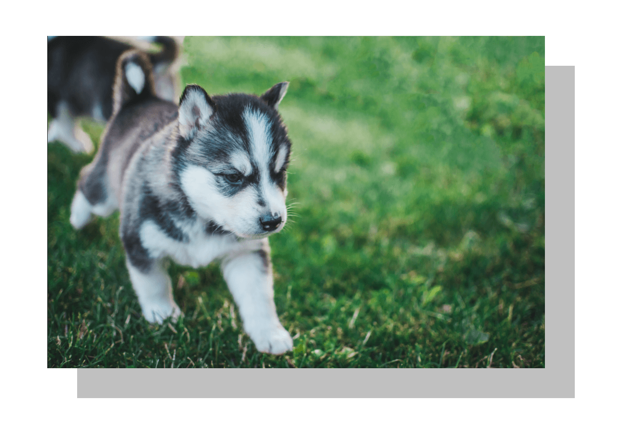
単に写真だけの場合よりも目を引きますよね。
コーディングをしているとこの表現方法はどこかで出てきますので、コードの書き方をしっかり身につけておきたいです。
今回はこのCSSの書き方を3パターン紹介します。
疑似要素
See the Pen
背景をずらす1 by toshi (@toshi78)
on CodePen.
.picture {
  margin: 30px auto;
  width: 300px;
  position: relative;
}

.picture::after {
  content: " ";
  position: absolute;
  right: -30px;
  bottom: -30px;
  width: 100%;
  height: 100%;
  background-color: #C0C0C0;
  z-index: -1;
}
💡ポイント!
- 親要素に「position: relative;」子要素に「position: absolute;」
- 「right: -30px;」「bottom: -30px;」で右下にずらす
- 「z-index: -1;」で重なり順を指定
box-shadow
See the Pen
背景をずらす2 by toshi (@toshi78)
on CodePen.
.picture {
  margin: 30px auto;
  width: 300px;
  box-shadow: 30px 30px 0 #C0C0C0;
}
💡ポイント!
- 「box-shadow: 30px 30px;」で右に30px、下に30pxの影をつける
linear-gradient
See the Pen
背景をずらす3 by toshi (@toshi78)
on CodePen.
.picture {
  margin: 30px auto;
  width: 300px;
  height: 160px;
  position: relative;
  background: linear-gradient(90deg, transparent 10%, #c0c0c0 10%);
}

.picture img {
  position: absolute;
  top: -50px;
  width: 90%;
}
💡ポイント!
- 「top: -50px;」で画像を上へずらす
- 「linear-gradient(90deg, transparent 10%, #c0c0c0 10%);」で背景色の幅を調整
最後のlinear-gradientを使いこなすにはある程度慣れが必要のようです。
ちょっと難しいですね。
まずは疑似要素の使い方をマスターしておけば、いろいろ応用が効くのではないでしょうか。
以上です。
投稿者 トシ
コメントを残す